Look Inside Homes By Taber’s New Website

Look Inside Homes By Taber’s New Website
March 6, 2019
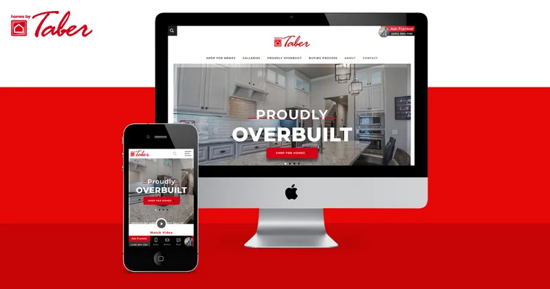
We don’t shop the way we used to. You can purchase just about anything from anywhere. Just use whatever device you have to link to the Internet and your worldwide shopping mall is open. Even homebuying has changed. A builder’s website is a virtual model home and showroom, so it better be a good reflection of the business. This week, we launched a full makeover and invite you to look inside Homes By Taber’s new website.
You may (or may not) be surprised that we have homebuyers who have actually purchased a home without ever setting foot in our physical model home. They currently live outside of Oklahoma—and even outside of the U.S.—and need to make choices based on our online presence. We had these buyers in mind when revamping the Homes By Taber website. It had to be so informative and user-friendly that someone could comfortably decide to buy a home and then choose which one to buy or build.
Our Marketing Director, Lindsay Haltom, spearheaded the website makeover, and it was a very personal experience for her and the rest of the team. She works with the online marketing tools every day and watches how our visitors use it. What do they experience? What could be better for them?
“Every day, we work to increase our customer experience. Our website is a living/breathing thing that is constantly being updated and refreshed to reflect what’s happening here and now,” Lindsay explained, “but there comes a time when adding on features doesn’t make sense and it’s just simply time to create a new one.”
Homes By Taber went back to the company that built the previous website, Builder Designs, and worked closely with their website development group to turn a successful website into something even greater.
Revved up
The new site is faster than before, which says a lot, because there wasn’t any noticeable lag time previously. Yet, technology advances. Data speeds increase. And it’s important to keep pace with change.
Mobile-ready
Mobile users, in particular will experience the lightning speed of our new site. With so many people using their smartphones and tablets to browse listings, the mobile-friendliness of a website is more critical than ever. Pages need to upload faster and fit the reduced screen size. See for yourself!
Choose your options
Homes By Taber’s new website will allow prospective buyers to get creative. Before WE build your home, YOU try your hand at it! Our interactive floor plans let you choose from the many options available. Click on the plan you want and then the options. Add a mud bench, bonus room, windows, half bath, and even more square footage. Play with exterior color selections by clicking through color schemes. You’ll see your home evolve as you explore all the possibilities.
A video view
If a picture tells a thousand words, then imagine what a video will say. You can find out by browsing our video gallery. From interactive virtual tours to how-to’s, product demos, and explanations of specific features (like the air filtration system and tankless water heater), this collection of videos is must-see viewing for any homebuyer.
Freshness, guaranteed
Whenever you come back to HomesByTaber.com, you’ll find something new. Our site is not a set-it-and-forget-it proposition. With so much happening here, we want you to share the energy, creativity, and excitement that is part of the Homes By Taber experience. We’ll continue to post updates, new photos and videos, and information that will help you enjoy the journey along the path to homeownership.
We haven’t designed our new website to just sell homes. We’ve created it to make it easier for you to make the right choices for a very important investment in your life. You’re in control and we’re simply giving you the tools to feel great about your new home. Of course, we’re here and ready to talk when you are!
Latest Posts
April 7, 2025
Breathe Easy, Live Safe: Built for Oklahoma Spring
March 28, 2025
Living in Piedmont, OK with Homes by Taber: A Thriving Community with Small-Town Charm
March 12, 2025
The Tunnel to Towers Foundation Delivers Smart Home to Injured Oklahoma Air Force Veteran
March 11, 2025
Why Everyone is Moving to Oklahoma: The Top Reasons to Relocate
February 28, 2025
The Difference Between a Quick Move-In Home and Building From Scratch: Breaking it Down
February 10, 2025
OKC Valentine’s Day Guide: Date Night Inspiration and At-Home Ideas
January 30, 2025
OKC School Districts — Homes by Taber’s Commitment to Excellence
January 29, 2025
Homes by Taber Partners with Tunnel to Towers to Build Functional Home for Disabled Veteran
January 13, 2025
Building a Brighter Future for the Local Community: Taber Cares
Previous Article

Right-Size Your Home
Next Article


